Showing posts with label Ratios. Show all posts

Wednesday, June 1, 2016

Saint Catharine College in Kentucky will be Closing

Linda Blackford reports for the Lexington (KY) Herald-Leader that St. Catharine College in Saint Catharine, KY will be closing in July.  The institution was founded by the Dominican Sisters of Peace in 1931.  "A note from the Board of Trustees" with the announcement is available on the college website.
While f.t.e. enrollment was 4.7% higher in fall 2015 than it was in fall 2003, it had peaked at 834 f.t.e. students in fall 2011 and had been trending downward in recent years.  Total revenues and investment income had increased since FY2004, by 53%...unfortunately, expenses more than doubled rising by 133%.
As a result, Saint Catharine's financial situation was unsustainable.  Following calculation of ratios, using a model publicized on The Sustainable University website, two stars are placed on the chart below.  The one in cell B3 reflects changes in Saint Catharine's expense and equity ratios for the five year period from FY2004 through FY2008.  The star in the A3 in the upper right hand corner reflects changes in ratios from FY2011 through FY2015.  


Supporting data for calculation of the ratios was pulled from the Integrated Postsecondary Education Data System (IPEDS) and is displayed in the following table.

Tuesday, May 31, 2016

Deteriorating Enrollment and Financial Situation Result in Closure of Dowling College


Adina Genn reported for the Long Island Business News today that Dowling College will close on June 3rd.  Dowling was founded in 1968 and the campus was centered on a former Vanderbilt estate.
The Chronicle of Higher Education also features an article by Emma Pettit, "Dowling College, Long in Financial Trouble will Close Friday."As both of these articles indicate, Dowling has been struggling to maintain enrollment and had been in financial difficulty for some time.  


Using a model publicized on The Sustainable University website, Dowling's financial situation was unsustainable and deteriorated in recent years.  Following calculation of ratios, two stars are placed on the chart.  The one in cell A2 reflects changes in Dowling's expense and equity ratios for the five year period from FY2004 through FY2008.  The star in the A3 in the upper right hand corner reflects changes in ratios from FY2011 through FY2015.

Data for the following table were pulled from the Integrated Postsecondary Education Data System (IPEDS) and certainly show the difficult situation  that led to the decision to close.  Expenses did not decline as rapidly as either enrollment or revenues over the period from FY2011 through FY2015.  

Thanks for reading and I look forward to your comments!

Thursday, May 19, 2016

Paint by Numbers...a picture of Burlington College's declining financial prospects

Burlington College's announcement this past week that it will be closing led to a flurry of news articles and blog posts that we have not seen since Sweet Briar College announced they would close back in March, 2015.  In the case of Sweet Briar, there was sharp disagreement between the former president and trustees who voted to close and the alumnae and friends who were shocked and ultimately victorious in their efforts save the institution.  

In contrast, there is apparent agreement among pundits commenting on Burlington's situation.  Everyone agrees that the college faced serious financial difficulty due to the accumulation of debt used  in 2010 to purchase the lakefront property that served as Burlington's campus in recent years.   

I was interested in seeing if a quick calculation using a few publicly available numbers would show a change in Burlington's financial situation and prospects after 2010.  In short, Burlington College presents another opportunity to explore changes in the institution's financial situation using a model publicized on The Sustainable University website.  

The chart and table were constructed using data pulled from the Integrated Postsecondary Education Data System (IPEDS).  FY2015 financial figures for Burlington College were not available.  

Following calculation of ratios, two stars are placed on the chart.  The one in cell C1 in the lower left hand corner reflects changes in Burlington's expense and equity ratios for the five year period from FY2004 through FY2008.  Burlington College may've been small during this period, but it was operating in a fiscally responsible way with institutional revenues covering expenses and a manageable level of debt.   

The star in cell A3 in the upper right hand corner represents a very different picture with changes in expense and equity ratios for the period from FY2010 through FY2014 pointing to an unsustainable situation.   

It is interesting to see the changes in enrollment and the corresponding changes in expenses and revenues.  You can also clearly see the impact of the property purchase on total assets with a corresponding increase in debt levels.

Thanks for reading and I am looking forward to your feedback and suggestions!

Tuesday, April 14, 2015

Finances at Women's Colleges...and at Sweet Briar College...May Be Better Than You've Been Led to Believe

Reading articles and blog posts over the past few weeks with authors speculating about the prospects for women's colleges led me to see if this might be a good time to calculate a few financial ratios and play a bit with Tableau Public's visualization software.  

I certainly learned a lot and enjoyed the opportunity.  I have also concluded that analysis of financial information available through the Integrated Postsecondary Education Data System (IPEDS) suggests that the financial health of women's colleges generally, and Sweet Briar College in particular, may be improving and is better than what you might think.  

The following tables summarize data for two five-year periods for 46 institutions...members of the Women's College Coalition that report financial information to IPEDS.  There are also a couple of institutions included that were women's institutions during the early years of this past decade before deciding to admit men as students.  These were retained since women still comprised 90% or more of their enrollment.  

The analysis used follows a model laid out by Bain and Company with their Sterling Partners on The Sustainable University website.  These pages are enjoying a bit of resurgence in popularity among pundits and are typically cited favorably as evidence that higher education is on shaky financial footing.  In contrast, I found that few, if any, critics of the approach provided any evidence that they attempted to replicate the analysis initially published in a brief linked off the site and authored by Jeff Denneen and Tom Dretler.  Instead, most comments in this latter category focus on the many organizational and policy suggestions offered. 

To put it simply, I wanted to see if the model might work.  The ratios are easy to calculate and provide an added benefit that you can compare both public and private institutions.  So, I started with data from the FY 2004-FY 2008 time frame and found that eight institutions, or 17% of those in the study were characterized as "financially sound."  

The number considered "financially sound" then rose to 32 institutions, or 70% of the group when using FY 2009-FY 2013 data.  The financial situation for Sweet Briar College showed similar signs of improvement during this period, moving from cell A-3 to C-2 in the following tables.  The one women's institution in the group that did close at the end of FY 2014 was Lexington College in Chicago, IL and it landed in cell A-3.

The process for placing institutions in cells involves calculation of the differences in two ratios between two points in time.  Three cells in the upper right hand corner reflect increasing expenses as a percentage of revenues and declining net assets as a percentage of total assets...and are considered as unsustainable for institutions.  In contrast, the ideal situation represented in cell C1 in the following table results from decreasing expense ratios and positive changes in the equity ratios.

The current Sustainable University site indicates that it is updated for 2014 and classifies 43% of the institutions as unsustainable, spending more than they can afford.  Note that this current 2014 update appears to cover a six year period spanning FY 2007 through FY 2012.   The initial briefing paper linked from the site that I mentioned previously appears to have used data from FY 2006 through FY 2010.

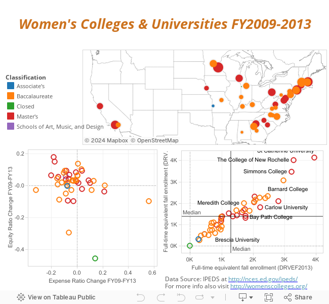
I also used the same IPEDS data for the women's colleges and universities to create a quick dashboard in Tableau Public that is inserted below.  You can hover over the views to see an institution's name with the corresponding values or you can access the data set through Tableau.


The initial view in the dashboard places institutions on the map with the size of the marker determined by Fall 2013 FTE enrollment and the color by their classification.  The view in the lower right hand corner places institutions by their ratios for the FY 2009 through FY 2013 period...please note that the vertical axis here is reversed from that used for The Sustainable University model described above.  Finally, the view in the lower right hand corner plots two FTE enrollment figures for each institution.

With the exception of Lexington College mentioned previously, it certainly appears that three-fourths of the women's colleges and universities were in a healthier financial position at the end of FY 2013 than they were five years earlier.

Thanks for reading and I am looking forward to your feedback and suggestions!